SOPHIYA THINK-INFIN


The Evolution of THE WRITTEN WORD
During A Level Graphics I created a study on the evolution of the written word, from cuneiform clay to Chinese wood block printing and even animated braille. Being a design study meant I created a lot of unpredictable, challenging but rewarding work alongside surveying many languages and written forms to investigate how humanity has recorded its thoughts over time.
IMPRESSED
The first era of linguistic graphic expression which uses an implement to press into a material. This chapter provides a historical grounding for the study through exploring the materials clay, oracle bone, stone and stucco, and wax along with the languages that used these forms
RECREATION: cuneiform tablets / mayan glyphs
For the Recreation element I created a Cuneiform tablet text using a chopstick and a lump of clay, and every part from creating the right tablet shape to replicating the language was a lot harder than I expected - although quite therapeutic once I got into a rhythm.
IN THE STYLE OF: roman type deconstructed in clay


DRAWN
The Drawn chapter analyses the handwritten form of language over a cross-section of the world’s languages celebrated for this form: Chinese, Celtic and Arabic scripts.
RECREATION: Arabic Calligraphy
After practising writing out individual characters many times I began to build on the final recreation, and actually found the central shape to be the most difficult to create with its scale and fluidity.
IN THE STYLE OF: English in the style of Arabic script
This transferred the hand-drawn skills I learnt in the recreation to a digital format. I analysed the geometry of the script and created a grid that I could use to create a stylised English alphabet.
PRINTED
The Printed chapter presents major technological developments and their impact on society and design. I focused on the methods of Chinese woodblock printing, metal type, the typewriter and lithography in the work of the contemporary artist Sam Winston.
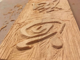
RECREATION: Chinese Woodblock Print
I loved the bold simplicity of Haku Maki’s work and the way in which he captures the swift movement of handwritten Chinese calligraphy in a static printed form.
In order to stay as authentic to his poem ‘Moon, Snow, Flower’ and methods as possible I created a wood block and template to carve out the letters and then ink with black and the three primary colours used in the original
IN THE STYLE OF: Haku Maki & Sam Winston Fusion
A fusion of the deconstructive style of an artist Sam Winston and the recreation piece by Haku Maki. I have used Chinese characters and definitions to convert Maki’s ‘Moon, Snow, Flower’ poem into a graphic poem with each section alluding to either the moon snow or flower.
FUTURE
The Future chapter represents the final stage in the evolution of the written word, and presents a much smaller variety of media, scripts and implements as writing becomes universally accessible through the use of digital technology.
RECREATION: 3D animated Adaptation of Braille Neue Font by Kosuke Takahashi
I recreated the Braille Neue font using the digital animation software Cheetah 3D. Teaching myself this new skill was very insightful and I also discovered a new way of experimenting with the magic of braille.

IN THE STYLE OF: Ji Lee and Braille Neue Fusion
This In the Style Of combines Ji Lee’s creative use of words and the aim for accessibility of the Braille Neue font. Ji Lee’s ‘Word Images’ are also animated and include allusive sounds - features which I adapted in this piece. This piece combines a host of different forms of graphic communication to essentially teach people how to read braille and ultimately prepare for when reading and writing become obselete.


